If you are reading this post, chances are that you have searched color correction vs color grading, and puzzled by the difference between them. Top posts from Studiobinder and Vimeo treat color correction as the first step and color grading as the next step in the entire workflow. It is misleading to some extent.
Color grading is the term to describe the end result of a colorist's work, and it is the whole process that includes "color correction" and "the creative stylizing process".
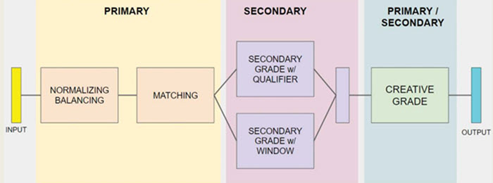
Color correction: When you import a footage into the color grading software or plug-ins, you will do some normalizing work to make the color right on your monitor; if there are imbalances such as over-exposure, lack of contrast and color cast, you shall correct them. Then there is shot matching to balance out the color of multiple clips in the same video, and next is the secondary grade that focuses on correcting specific areas and values.
Therefore, when you are performing the color correction for some technical issues, you are doing the primary and secondary color grading, and when you go on to create a look, stylizing your footage for expressive and aesthetic concerns, you can play around with the creative grade.
Part 1. Color Correction vs Color Grading: The Basics
What are we dealing with when we are talking about the coloring work?
There are many YouTubers sharing their recipe of "how I get this filmic look". Following their steps may or may not give you the exact filmic look, and you still have no idea of why you are pushing this slider or dragging that curve.
A little background knowledge will shed light on how to identify the things you need to correct, and how to come up with a color grading plan.
These color grading basics are applicable to each piece of decent color grading software, even though different tools offer you different degree of control, the inherent mechanism stays the same.
What Is White Balance in Video Color Correction
Our eyes can lie to us. Let's say you shoot a video featuring a house with a white wall, and that wall is affected by the light temperature and appears yellow. We would think of that wall as white, while it is yellowish if you use an eyedropper to pick the color value.
White balance is the process of rendering what supposed to be white in reality into white in post-production, thus eliminating unrealistic color cast. In this way, it can prevent your shot from being too orange or too blue, comparing to what the scene actually looks like to your eye.
What Is Exposure in Primary Color Grade/Color Correction
Exposure is the amount of light recorded by your camera sensor. When a shot is underexposure, your video looks dim, with many blacks and greys; on the contrary, overexposure shot contains more light than needed.
Therefore, one of the tasks in color correcting a clip involves adjusting exposure and light levels to balance out your shot. A properly exposed shot ensures that you have nice details in both highlighted and shadowed areas.
What Are Brightness and Contrast in Color Grading
We are using the term luminance and brightness interchangeably in this article. Though in serious writing, luminance can be measured objectively as "Candela per Square Meter", while brightness is more of a subjective attribute of light. You can say something is very dim or very bright. In terms of color correction and color grading, brightness indicates the level of light in your color.
Dark pixels and light pixels together form a contrast in the image, the larger the difference between the lightest and darkest pixels, the more prominent the contrast would be. Therefore, setting highlights and shadows in the color correction process will result in how much contrast you have in the shot.
During the color grading stage, whether to go contrasty or apply a flat look is more of an aesthetic decision, and it depends on the visual message you prefer to convey, as long as the looks are consistent throughout the shots in the scenes.
Cullen Kelly at Frame.io analyzed some fantastic examples with high-con or low-con look, with tips on when to use which.
What Is Hue and Saturation
Hue is the color itself. Red, green, blue, yellow… each of these is a hue. It is a degree to which a color can be described as similar to or different from those dominant colors. For instance, most of the lipsticks have a hue of red, no matter it is crimson, scarlet, blush or ruby red. Despite the difference they have, we would instantly treat them all as red. While colors as navy, sky, azure and ocean blue are different enough from the hue of red, but all similar enough to be grouped under the hue of blue.

Saturation is the degree of purity or intensity of a color. When you add more black, white and grey to a color, it becomes less saturated. You can play around with a color picker in Premiere, DaVinci, Photoshop or any other software to better understand the idea.
Part 2. Color Grading Workflow
It's not likely that most of our readers are full-time colorists. However, with essential concepts and tools explained in the previous part, and with powerful color grading software that are user-friendly for editors, hobbyists and amateurs, we can be a do-it-all person to grade our footage.
Here are some aspects worth noticing:
- Camera settings: Are you shooting RAW, LOG or general footage? Have you correctly set the in-camera white balance?
- Room set: Are there any light in your room that will interfere with your eye? What is the color of your wall?
- Monitor calibration: Have you calibrated the monitor of your computer?
How to Color Correct a Video
Color correction aims to balance out the color of all the shots of your video, and give your footage a natural color as you see it in real life. It is the foundation for any further color adjustment. You cannot go straight to secondary color grading without color correction in the first step. Otherwise, it might yield unexpected results.
You can do color correction manually or apply a correction LUT, though you still need to make some adjustments after importing the LUT.
1. Normalize your video in color correction
Adjust white balance, exposure, contrast, saturation and hue to make your footage less flat. Read and interpret scopes before making a color correction plan.
For instance, you can use the RGB parade to check if the highlighted areas are overexposed. How about the blacks? With the waveform, you can check whether you have enough contrast in shadows, midtones and highlights.
You can use sliders or the curve tool to adjust the luminance of the video, create contrast between dark and light areas, and remove grey from color by increasing saturation.
2. Shot matching
Performing the base grade helps you to establish an overall consistency. Go scrubbing through your shots and clips and make sure you have a relatively consistent luminance and chrominance throughout.
A practical tip is to keep watching your scopes during the scrubbing. When you color correct one frame, there might not be a pure dark area, thus you won't see your blacks clipping out of the Rec.709 range. However, when you make the shadow areas darker and reach 5% in this frame, and move to the next frame, you might find there are pure dark pixels now being clipped and drag down to 0%.
Most color grading software have the comparing function. You can compare your hero shot with clips to be match side by side. The comparing process is not done bare eyes, as you can compare the scopes of two images and make adjustments accordingly.
3. Fix problematic areas
After doing your primaries and achieving a balanced shot for the overall image, there might be some problems in specific areas. You can use qualifiers and masks to affect only selected areas, and even out values to bring those colors in line with how your eye perceives them.
For instance, it is tricky to get skin tone right after shot matching, yet the shade of the skin is the easiest to notice when it differs from reality. You can either use the qualifier or draw a mask to isolate the skin tone area, and change its RGB value. The vectorscope in DaVinci Resolve has a "Skin Tone Line" for your reference.
Interested in Creating the Look?
When you are done with color correction with each shot and clip of the entire video, you can stop the color work. At this stage, your footage will appear as naturalistic as possible, and conforms to the broadcast standard. However, many of us won't stop here, and that's when the creative process begins.
How to Color Grade Video to a Specific Look
The stylizing part in color grading is a creative process to transform your footage for the final look. It is more of aesthetic concerns than right-or-wrong decisions. Stylizing gives your footage a visual tone, creating a mood and atmosphere that are in line with the theme of the video.
Good news for beginners: you can copy the look from color masters and auto-apply it to your footage. The files you need are the creative LUTs we mentioned in part 2. Yet the bad news is: LUTs won't always give you the exact look as the demonstration. There are several reasons behind it. 1. You haven't done color correction properly. 2. The actual content of your image differs greatly from the original content of that LUT. For instance, a LUT might be made specifically for landscape videos and is color graded accordingly. When you apply it to your footage with people in the composition, the skin color might look unnatural.
Color theories are essential for you to perform a better color work, whether it is color correction or color grading. Besides, knowing the mechanism of those coloring tools in terms of color theory is equally important. The topic of color theories for color correction and color grading deserves another in-depth article, and even a book to cover it. Still, we have some cases here to give you a basic idea.
Part 3. Color Correction and Color Grading Tools
As we have discussed in Part 1, when we are talking about the coloring work in production, we are dealing with the color space of the video file, white balance, exposure, contrast, highlight and shadows, hue, saturation, etc. How do we deal with all these aspects? What are the tools we can use to adjust white balance, contrast and so on? How do we know whether the adjustments are properly done?
- To adjust these parameters, you can use color wheels, curves and HSL qualifiers.
- To analyze the parameters before or after the adjustment, you can read scopes, including waveform, histogram and vectorscope.
We are using tools from Premiere Pro and DaVinci Resolve as examples, but the fundamentals are applicable to other NLE systems and color grading programs. Let's meet the tools one by one below.
1. Color Wheel Palette
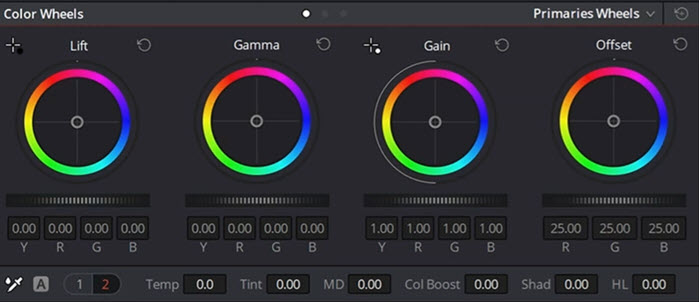
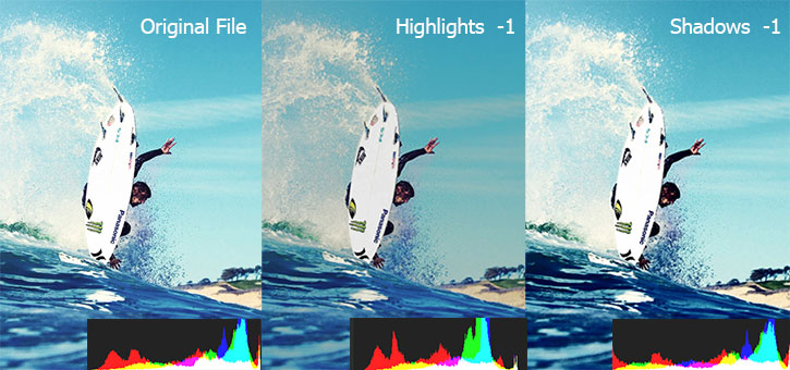
Color wheel palette allows you to affect the brightness and hue of the image in your shot. To be more specific, there are three wheels each targeting a specific luminance range, namely, shadows, midtones, and highlights. The Offset wheel applies the overall changes for all areas. For example, when your footage is under-exposed, you can adjust the overall brightness by dragging the slider in Offset, it will make shadow, midtone and highlight areas brighter altogether.
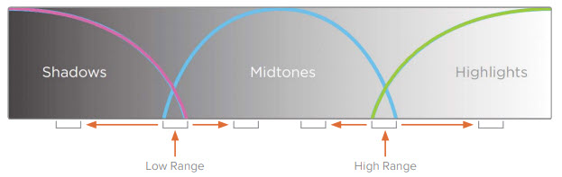
Shadow, Midtone and Highlight
Shadows are darkest areas (pixels) in your image; highlights, the brightest area; and there are light areas that are "not so dark and not so bright". It would drive us nuts if we refer to those areas everytime as "not so dark and not so bright", so we call it — midtone!
Dragging the slider left or right will change the brightness of the image. For instance, dragging the slider under Lift (shadow) toward the left will make the dark area darker, slider under Gain (highlight) toward the right will make the highlight area brighter.
How about adding a hue to the shadow or to the highlight? That's where color wheels come into play. For instance, if you drag the pointer in Lift toward the red hue, you will see there is a hue of red in the shadow area in your image. Want to add a tint of blue in the sky? Go drag the pointer in Gain toward the blue hue if the sky is the brightest area in your shot.
2. Curves
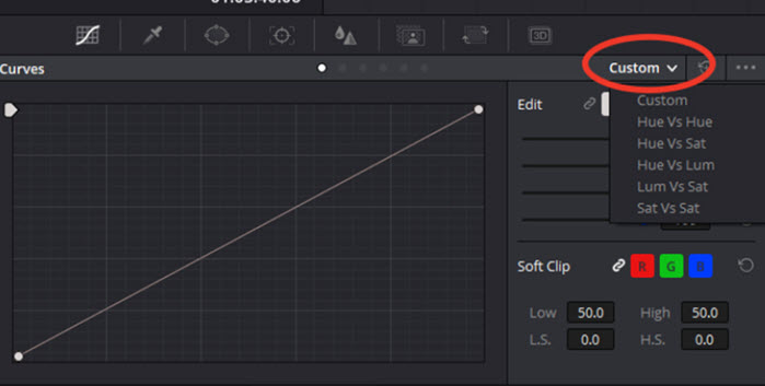
Just as the wheels can affect the image based on its luminance, the curves do a similar job in a different form. Plus, it is also able to alter the image based on RGB channels.
Great flexibility is offered in DaVinci Resolve's curve palette. For instance, you can add pointers and drag them to create the S-curve to make bright areas brighter and dark areas darker.
If you want to change the saturation of a certain color, select Hue vs Sat. Analogously, you can guess what these operations mean:
- Hue vs. Hue: change the selected color and alter it to another color.
- Hue vs Sat: Select a color, and change its saturation.
- Hue vs Lum: Select a color and change its luminance.
- Lum vs Sat: Select a luminance range and change its saturation.
- Sat vs Sat: Change saturation based on how saturated the pixels already are.
3. HSL Qualifiers
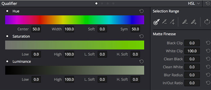
HSL qualifiers allow you to make better targeting fixes. You can use an eyedropper to pick a hue from your shot, and adjust its hue, saturation, and luminance accordingly. It is extremely helpful when you are dealing with memory colors, such as skin tones, sky and landscape. We all know that sky is blue and white, the landscape is green and brown. If the sky becomes green and grass appears to be pink, the audience would instantly notice the color cast—unless you intended to do so.
4. Scopes
The scopes are handy tools to accurately assess colors in videos. No matter you are trying to measure the hue and saturation of a shot, or making sure you are not clipping the whites or crushing the blacks in the scene, you can trust scopes.
The scopes read the information directly from the digital signal, and display it for you to interpret. It's not affected by your environment or your monitor settings that might skew your perception. On the contrary, our eyes can lie to us because they adapt to colors and can be affected by the surrounding environment, and our monitor might not be properly calibrated.
The commonly used scopes tools are waveform scopes, vectorscopes and histogram scopes. You shall see some or all of them in Davinci Resolve, Premiere and the likes. You can read one of these scopes or use them in combination to better guide your coloring process.
If your video is meant for broadcasting, rules and technical requirements are of great importance, adhering to them can make sure that your video could be displayed properly on every television. Scopes allow you to analyze whether your footage sticks to those requirements.
4.1 Waveform Scopes
Waveform tells you the luma levels of your image, and displays it in correspondence with the areas of your image from left to right.
How can it help:
You can read the waveform for exposure and grading. It provides you with good and accurate info, such as whether the shot is over-exposed or under-exposed.
Take HD video as an example, the brightness is set from 0 to 100, darkness below 0 will be clipped, and brightness above 100 will also be clipped. If you see the waveform goes under 0 and beyond 100, that image is overexposure, and you would want to adjust it, to bring the highlights down, and slightly bright the darkest part.
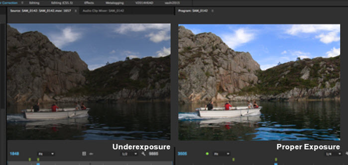
Let's take a look at an underexposure shot below: the brighter part corresponding to the sky and the brightest part to the cloud, while the dark parts are the waters. It ranges from 5 to 80, so we know that the cloud is not white, otherwise, it would be 100; and the darkest part is not pure dark, because it is not 0.
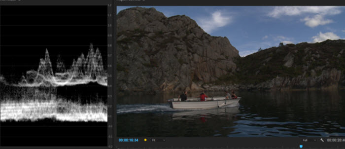
We want to make the bright part brighter to add white color to the cloud; and we prefer the midtones and shadows to spread over a wider range on the brightness level, so that there will be more contrasts and details. After correction, you shall see the waveform now have a wide range, and at the same time not exceeding the 0-100 limit.
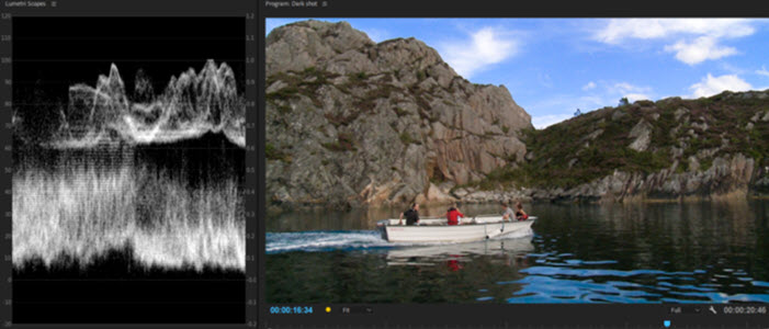
The 0-100 IRE is the brightness scale invented by the International Radio Engineer society for HD displays. Anything goes under 0 would be showed as pure black, without any detail, and above 100, pure white, also with no detail (clipped). 45IRE is approx. middle grey. Although it is possible to exceed the 100 IRE with modern televisions such as UHD displays, it is still safer to keep your shot within that 100 IRE range.
4.2 Vectorscopes
Vectorscope helps you to analyze the saturation and hue of the image. The further from the center, the more saturated a color is; the direction of the trace tells you the hue of the pixels in your image. Therefore, if your image is monochromatic, let's say, mostly yellow, you shall see the trace angled toward that color; if you have many colors in the image, you shall see the trace spread in many directions. If you have a highly saturated image, the trace on the vectorscope goes wide; on the contrary, if your images are flat and de-saturated, you shall see a small dot in the middle of the vectorscope.
How can it help:
You can use vectorscope to adjust memory colors such as skin tones, sky, and terrain. Plus, it also tells you the saturation of a color, so that you can make sure the colors are within the legal saturation to broadcast. Should the traces in the scope go outside the area of "legal" saturation, it means the colors are too saturated to broadcast.
4.3 Histogram
Histogram measures the amount of dark and bright pixels. Unlike waveform, it doesn't map the position of the pixels onto the histogram. The horizontal axis shows the luminance of the pixels, with darkest pixels on the left side, and brightest pixels on the right side. The vertical axis indicates the number of pixels corresponding to a given brightness.
For detailed introduction and its application, read this article on Histogram in plain language.
5. Color Match
Color match tools help you to archive color consistency throughout the entire video. It is normal to have multiple scenes shot under different lighting conditions, and when you assemble them into one video, the jarring color looks amateurish. To get a consistent look, you can choose several wide shots to color grade and color match them. Once you establish the overall color palette, you can then match the color of close-ups to the hero shot.
6. LUT
LUT (Look-Up-Table) is a file containing instructions to replace a color to another color based on RGB value. It usually has a .CUBE or .3DL extension, and you can import it into Premiere, DaVinci Resolve and any other programs supporting LUTs.
6.1 Technical LUTs
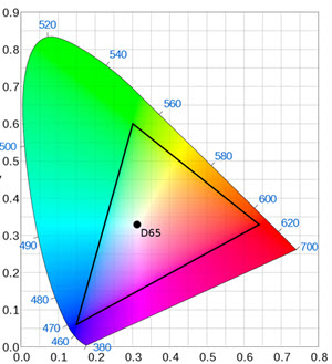
A technical LUT converts the color space of log image into another color space, for instance, into a Rec. 709 profile for HDTVs standard. The color space of Rec. 709 falls within the triangle below, and therefore, there are more colors in nature (outside that triangle area) that fail to be displayed by our HDTVs and monitors. Log files apply a different gamma curve to preserve more details, at the cost of low saturation and contrast. Cameras and drones that allow you to shot log will have a footage that looks "flat" out of the camera, and that's where technical LUTs come into use.
You can also manually adjust luminance, contrast, saturation and hue of log footage to normalize the video. Technical LUTs simply automate this process.
Note: Different manufacturers have their own proprietary LOG files, make sure to choose the corresponding one when converting to Rec.709.
| Manufacturer/Brand | Name | Settings |
|---|---|---|
DJI |
D-Log | Camera settings > Color |
Sony |
S-Log |
Camera Settings > Color/WB/Img Processing > Picture Profile/Creative Style |
Canon |
C-Log |
Camera Settings > Picture Style |
Panasonic |
V-Log | Settings > Photo Style |
Fujifilm |
F-Log | Movie Settings > Film Simulation Mode |
Nikon |
N-Log | Settings > Picture Control |
Red |
Redlog | Settings > Color space/Gamma Space |
Arri |
Log C | Settings > Color space/Gamma Space |
6.2 Creative LUTs
While technical LUTs bring your footage into the normal color of what we see with our eyes in nature, a creative LUT is not about right or wrong. It gives you the look you want, in order to convey a certain mood or feel of your footage. That's what colorists do in creative color grading, and creative LUTs just automate that process. If you see a fantastic filmic look and want to apply it to your footage, you can apply LUTs from that video to your own work.
Note: LUTs don't provide you the magic of 1-click auto color grading. If you want the look to be the same as the example, you still need to make sure you have the right white balance, contrast, saturation, etc. That's why you always go for color correction in the first place before creative color grading.
Simple Free Color Grading Software for Beginners
As can be seen from the previous part, there are tons of intricate tools for the professional pipeline. It takes years of training and in-the-field work for a colorist to nail the job.
For general users in need to improve their footage and make cinematic video, VideoProc Vlogger is a nice choice. It is a simple video editor with color grading panel powerful enough to deal with vlogs and everyday footage.
VideoProc Vlogger - Free Color Grading Video Editor for Beginners
- Stock color filters for all types of footage and images
- Add custom LUTs from online resources, realtime adjustments
- Adjust temparature, contrast, hue, saturation, etc.
- HSL secondary to select a hue and change its color, saturation, luminance

Use Color Filters for Travel, Life Style, Night, Portrait Videos/Images
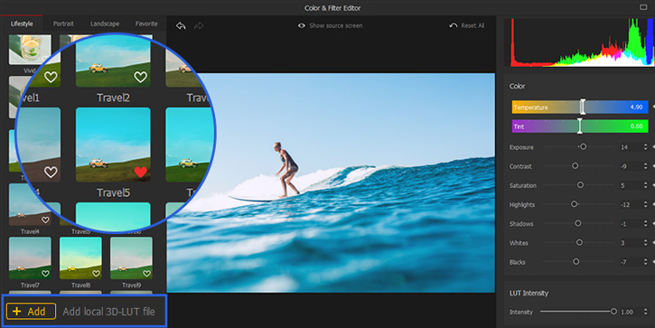
Import Custom LUTs and Make Adjustments
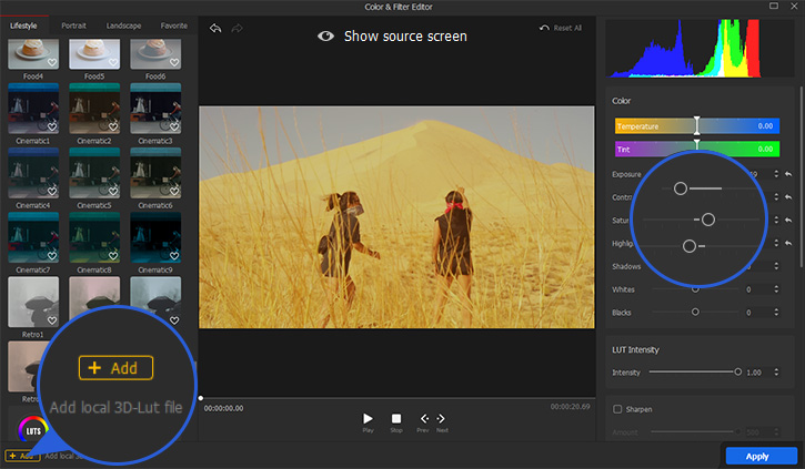
Adjust Contrast, Saturation, Hue and More Parameters
Part 5. Color Correction and Color Grading Examples
Case 1: Red + Green + Blue = White
Unlike colors reflected into our eyes in nature, colors from monitors and screens go directly into our eyes. TVs and screens use Red, Green, and Blue (RGB) as primary colors, mixing different values of each will create more colors. When you mix some amount of Red, Green and Blue, you get black, grey or white light. When you mix all three colors, you get pure, white light.
How to apply it in color correction?
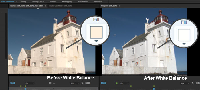
Let's take a look at the lighthouse below. What is the color of its wall? You might say it is white. Yes, it is white in reality, but the RGB scope tells us that there are more red and green light than the blue light. You can validate this by using an eyedropper, and indeed, the color has a pale orange-ish tone, a result of mixing red and green.
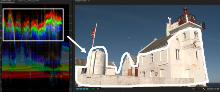
Now that we want the wall to be white, there should be a mixing of all the red, green and blue light. There, the operation is to increase more blue, and add some green, so that they overlap with red and become the white color. You can use the quick white balance tool, drag the sliders in color wheels or use the curve tool.

Case 2: Orange and Teal Look
Colors on the opposite sides of the color wheel are complementary colors, which form strong contract against each other. Love it or hate it, the orange and teal look has been quite popular in Hollywood blockbuster movies. It is appealing because there is a color contrast between the orange and the teal hue.
How to apply it in color grading?
The practice has become a cliché to push up oranges and yellows in the highlighted areas, and to add a shade of blues into the shadows. Yellowish color and its analogous color have larger luminance value than blue and teal colors. Therefore, if you want to affect the orange color, you are dealing with the highlights, and blues, shadows. Now you know how to spin your color wheel to get a desired look.